Tommy Pike Customs
Recreating a website for a Custom Car Company
01/2021
Tommy Pike Customs was a project about recreating their website. Tommy Pike Customs is a small company that does any and everything with cars and customization.
Problem.
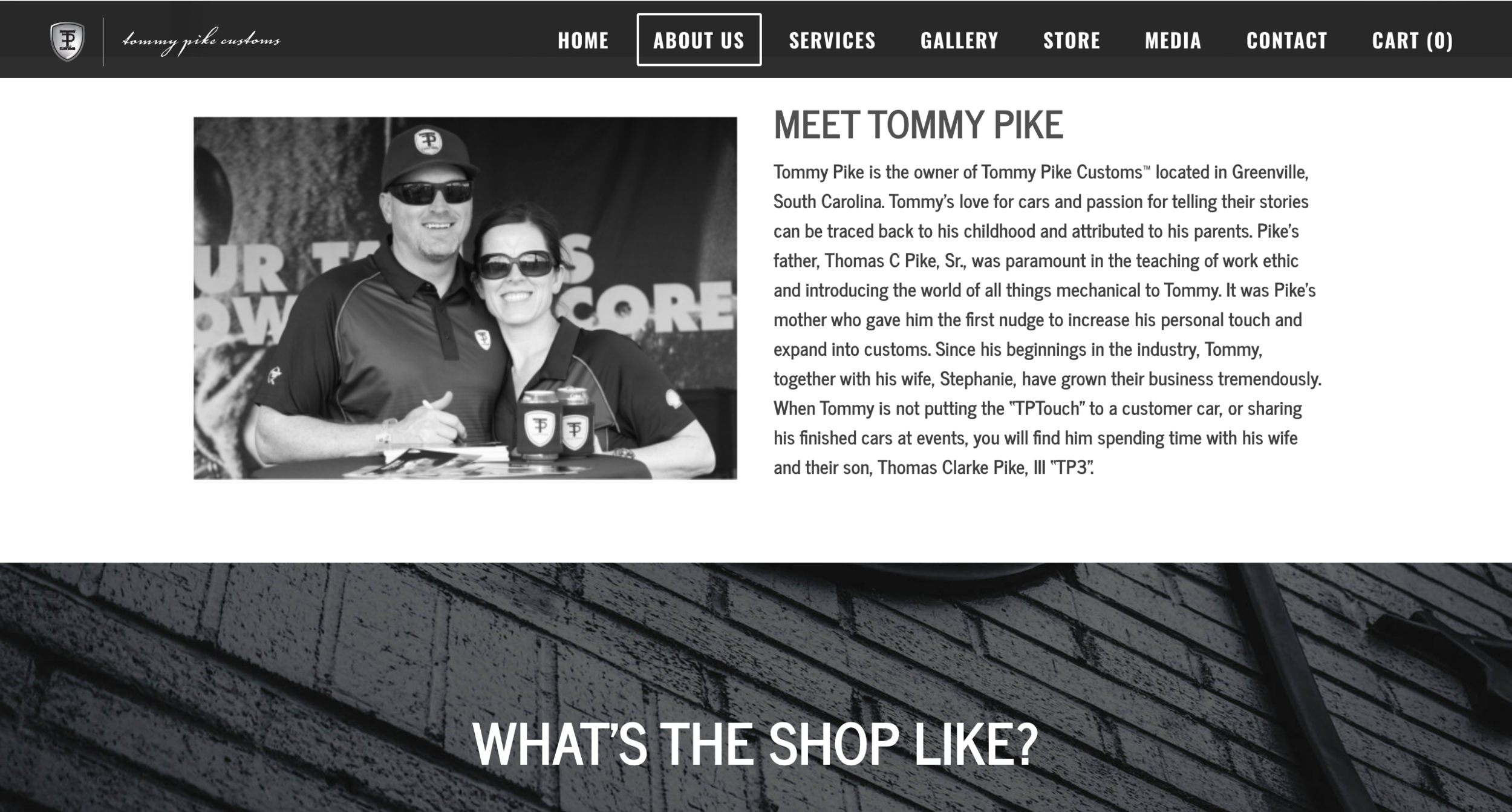
Tommy Pike Customs had a website, but it suffered three problems. The first problem was that the owners talked a big talk about how professional the company is, but the website reflected the opposite. It was a standard design website, but it looked like someone had tried to pack the website with content that was not created for the website. The second problem was that the owners made the website for themselves and not the average users. They did not realize that a website is more like a mall that a user is looking for something related to the company and not necessarily about the owner. The third problem was that the company was not telling the story that they wanted to. All companies have a message that they need to convey to their customers. For example, Apple conveys expensive and high-quality products. With Tommy’s website, we needed to convey that we create vehicles by our customers' stories.
Research I.
The research I achieved for the website and my thought process was all in person. I went to coffee shops to get random users' input and interviewed customers of the company to get the results I needed. Unfortunately, all research was destroyed when leaving the company. I, however, did not destroy my empathy mapping and journey mapping. These two UX processes should reflect my research on the original website, and my decisions in redesigning the site.


Empathy Mapping.
The empathy mapping helped me understand the customers and users of the Tommy Pike Customs website. What the empathy mapping showed me was that users ponder the website to be cool and bold. However, in terms of a professional-looking website, the users would give the website a one-star review. The non-professionalism impression is an enigma because Mr. Pike's target audiences are corporate companies and billionaires. So the goal is to redesign the website with a cool but professional style.
Another point the Empathy Mapping revealed was that the site had many pain points. When testing, users would hop around from page to page, struggling to find what they are searching for. Some users found what they were looking for and some didn't. An example of this was, users would look for pictures on the gallery page but find pdfs of cars instead of images. Having that experience made the users describe the website as confusing and frustrating.
Journey Mapping.
As we discussed in the empathy mapping section, there are countless pain points the users pass through to experience the site. To figure out all the pain points, I journey mapped the old website and what the new site should look like. The old Journey map showed that the majority of the information on the site was either in the wrong spot or displayed information in print form instead of digital. Another pain point in the journey mapping was that the website was clearly made for the company instead of the user.
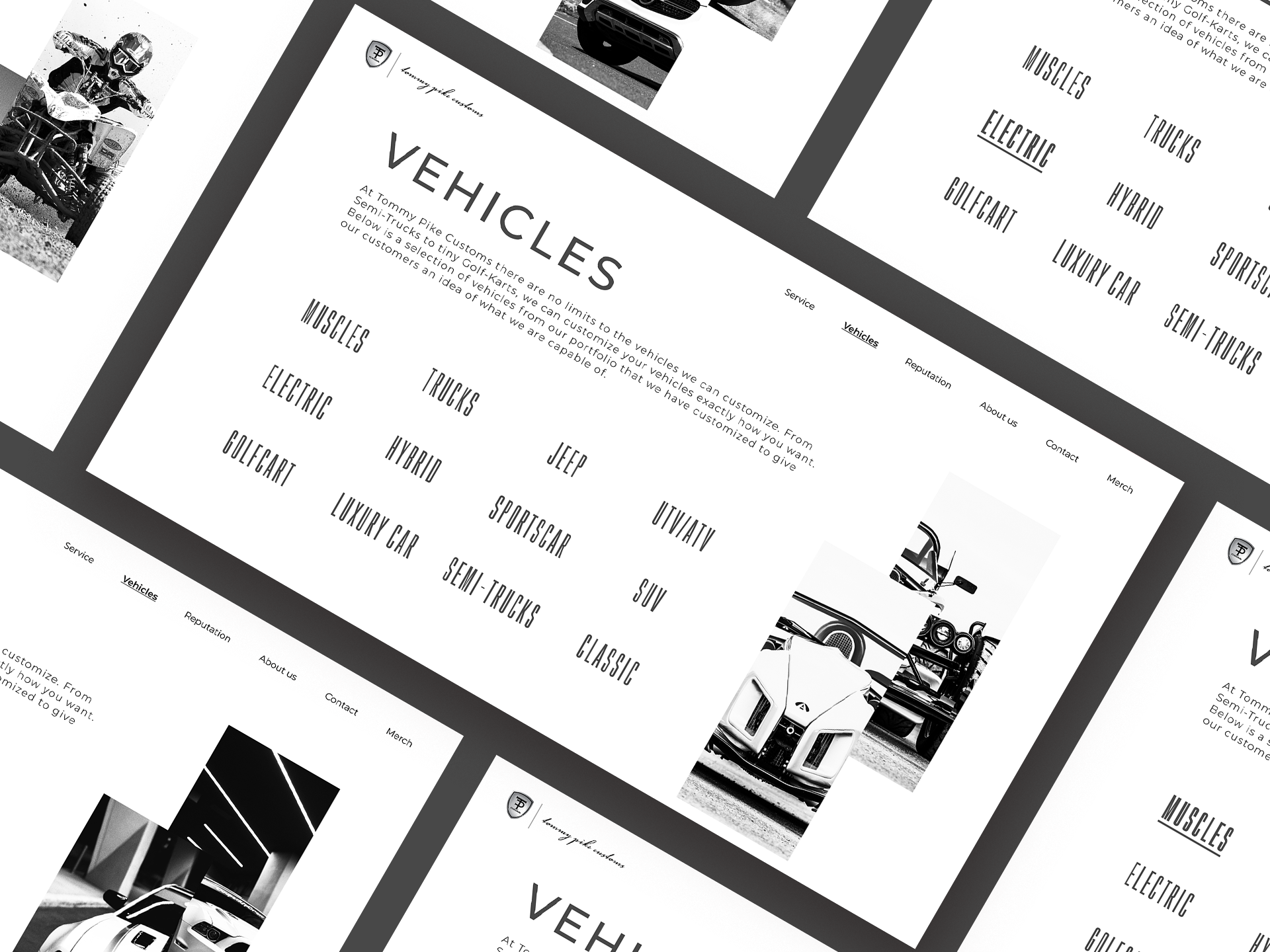
Because of these pain points, the first thing I did was reorganize the menus. Instead of: Home > About Us > Services > Gallery > Store > Media > Contact, I changed it to Home > Services > Vehicles > Reputation > About Us > Contact > Merch. This change helps users' lives by giving users the pages they would enter first. The pages users would enter first are the services and vehicles, instead of the About Us Page, which explains Mr. Pike's family history instead of the company's history.
Another solution to the empathy mapping problems was to rename titles, like the gallery to vehicles. By renaming ceratin page titles help clarify to the users what is in the page link.


Style Guide.
color.
The colors chosen for the website are based on the company's color. The Primary Color of the old website was (#000000) black, but there was no breathing room in the design, so I decided to change it. I decided that my primary color is going to be (#ffffff) white with one variant, (#cccccc) light mid-grey. The secondary color is (#484848) mid grey with two variants: (#e2e4e4) light grey and (#818383) dark grey. Other than these main colors, the background and surface colors are (#ffffff) white, and the error color is (#b00020) red.
fonts.
Tommy Pike Customs brand guidelines fonts are Gobold and Futura. The problem with these fonts is that both fonts are hard to use for running text because they can come out to bold. To fix this problem, I chose to pick the least shouting font as the display-text and running-text, which is Montserrat and used Gobold as an accent font.
style.
A lot of design choices for this website were inspired by Apple and Oneplus' websites. The reason why I had chosen these two companies was that they are some of the most professional websites out there. If you look at both websites they make everything simple and easy to find.

The Finial Product.
Solution.
To solve my first problem, I used a lot of inspiration from professionally established companies. The two companies I drew inspiration from were Apple and Oneplus. I choose Apple because they have the cleanest website out there while keeping the user as the primary importance. I then looked at One Plus because they had a unique website in the way they present their products to see how creative I can get with the website. I solved the problem by adding more breathing room and updated color palettes to the new website while adding newly updated layouts. The second solution was designing the website for the user. I knew from being a person that loves cars but had no idea how to fix one that I would not understand vehicle vocabulary. So I made an area where users can educate themselves about vehicle customs; this allows the user to know what they want for their vehicles. I also made sure when a user comes on the website, they can see what range of automobiles that we have done; this lets the user know what we offer and helps them understand if they want to do business with us. The final solution was trying to weave a message through the website. Tommy always talked about how when he makes a vehicle he puts the customer's personality and story in the car; this meant I had to word the website in a unique way to show customers that we grab their quintessence and create something new in a vehicle.


