Delta.
Delta.
WARNING!!! Please note that this project has nothing to do with the actual company and is a theoretical application. The project is also a work in progress, but hopefully you as the viewers can follow me through the process and work.
Story Time.
As the creator, I want to give some context to the motivation of the work so that you may understand the project a little better before moving any further.
I am an experienced flyer. My parents are a missionary to Thailand, so I have taken several flights back and forth from Thailand to America since I was little. However, I was taking a flight with my first-time flyer wife to Indiana for thanksgiving. We both got lost in the Detroit Airport (not going to lie, Detroit International Airport has a good layout even though we got lost) and ended up having to go through TSA twice. After going through TSA twice. We went to the restroom and I doubled check DELTA’s App on how we are doing on time. However, I was met with (to me) a change in time and the chance we would miss our flight. So we panicked and ran to the gate. It turned out the same area you would find the departing time on the app, was changed to boarding time and we were not going to miss our flight.
Goal.
The overarching goal for this project was to create a redesign of DELTA’s app that solves the user experience problems, as well as introduce new technology and new experiences for flying. This app will focus on making sure the user experience is designed for flying and not just purchasing a ticket. Everything from parking to directions to the gate will be thought of.
Problem.
Other than the prologue explaining the problems of DELTA’s application there are several user experience problems DETLA’s application has. For example, upon entering the application. You are greeted with 25 menu options. There should always be at least a maximum of 6 menus, with sub-menus helping to contain the bulk of information (Steve Krug). This is to help users remain confused about where to look. A summary of the problems that I will be facing are: integrating new technology, reorganizing the application, recreating the application for airport experience, and solving a very complex application.
New Technology. Innovation Ideas.
Below is a list of innovations that I wanted to integrate into the application.
4-installment payment
Pre TSA Delta Priority
Passport + ID digital holder
Real-time overview notifications on Changes, Directions, & Time Limit
Free Wifi for standard app requirements on aircraft
RFID Chip Technology
Apple Smart Watch Integration
Less human interaction during purchasing and printing ticket
Integration of Xbox Cloud
Research. + Notes.
Notes.
Empathy Mapping.
Input Text
Original Journey Map
Input Text
Journey Mapping.
Input Text
Wireframes.
Content below are placement holder for future work!
Content below are placement holder for future work!
STOP!
Style Guide.
color.
The main color is a pale green color named #87C519. The secondary color is white (#FFFFFF) and a light blue (#3694FF) color for selection. The color is to reflect the color of the logo and brand. I also added (#87C519) green in different shades to add some contrast to the site. I also made it so if the user is not keeping up with their payments, the site will turn red (#c51919).
fonts.
There was not much use of fonts here since I was trying to keep things simple. So the display font and running text font are both the font Gotham in different weights. The display font is Gotham Book, and the running text font is Gotham Light.
style.
The Style I was trying to go for is a clean and simple web page. I rounded corners to give it a soft and friendly look. Nothing fancy and nothing to in your face was the key to this design. This website should be a simple site that people pass through and not linger.

The Finial Product.
Solution.
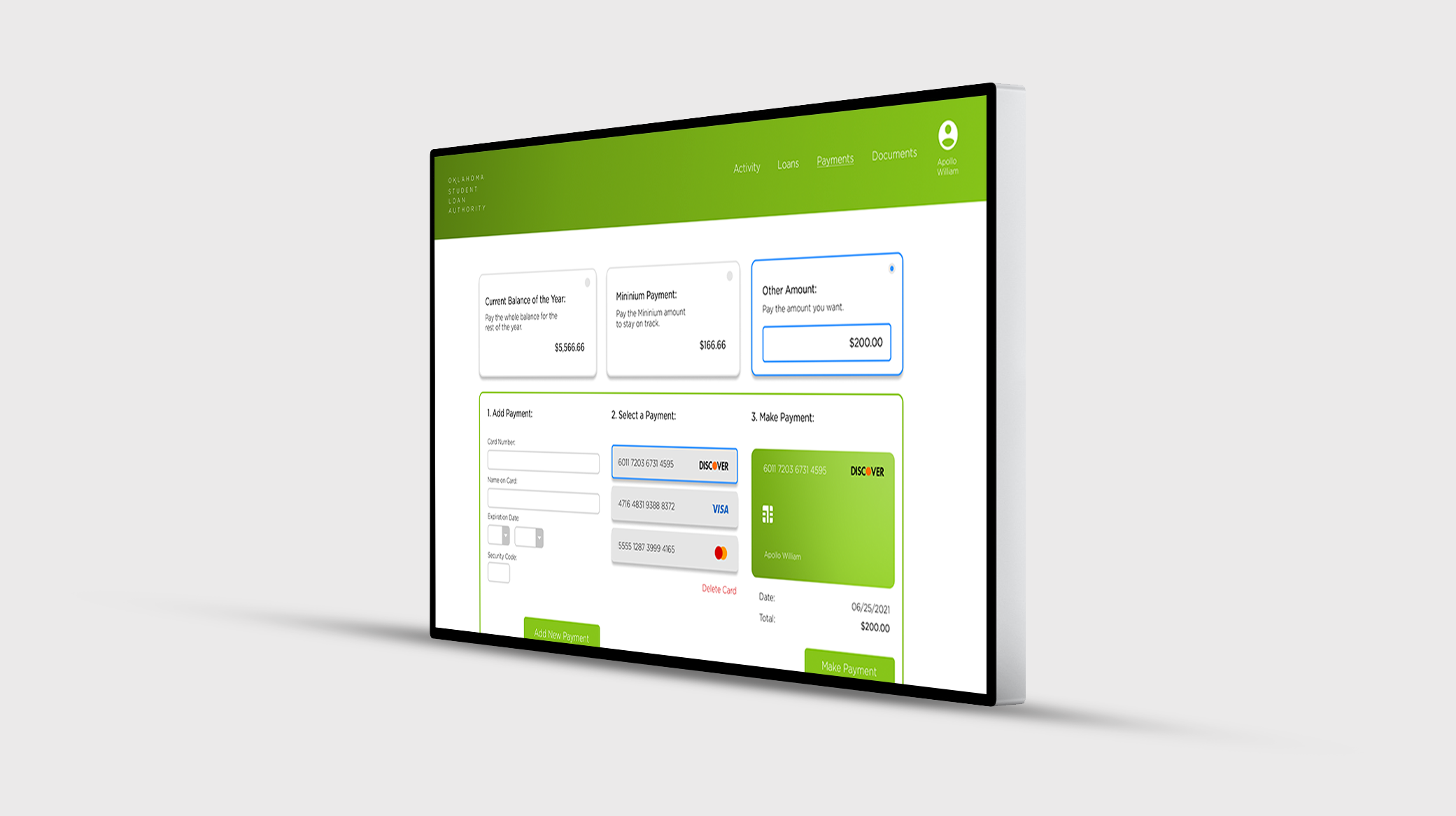
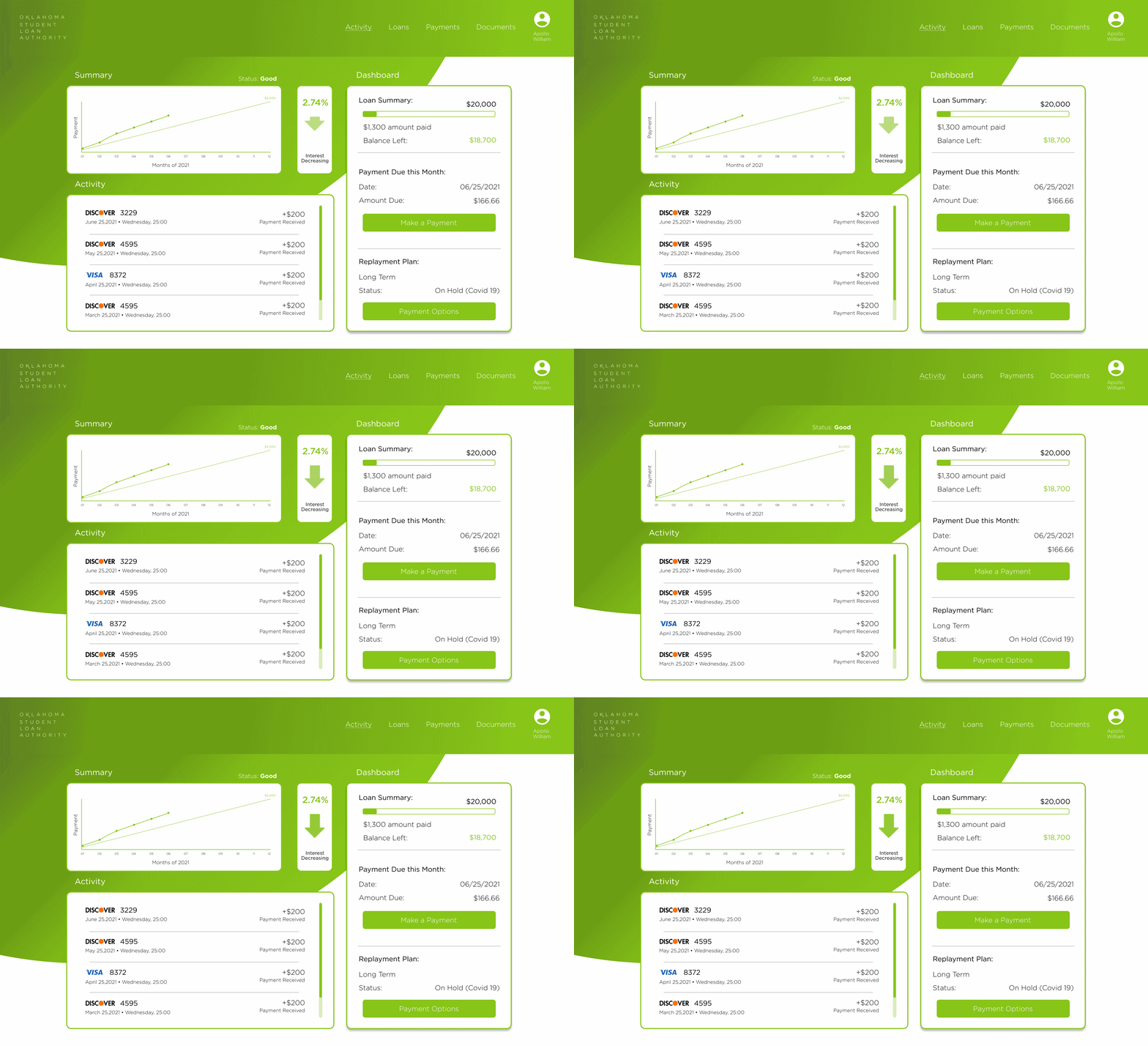
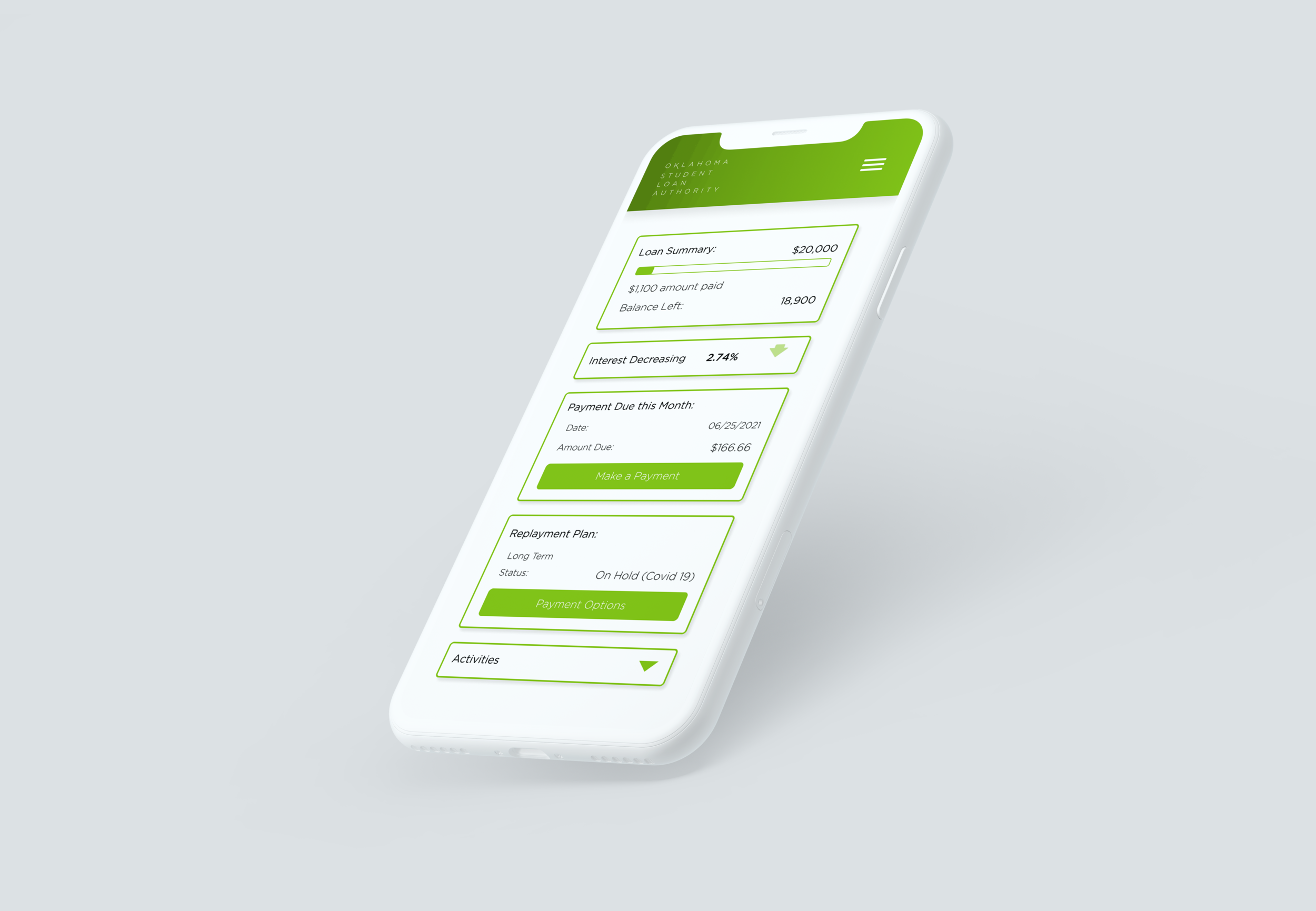
Here is the final product for the Oklahoma Student Loan Authority. As you can see, the OSLA website got a new UI look, trying to keep it clean and fresh. Added to the website is a graph that shows the user's progress during the year to give the user information and encourage them to keep being faithful to their payments. Underneath the graph is a list of the payments the users have already made to keep track of their payments and to confirm payment after paying. To the right of the graph is an animation of an increase or decrease of interest. The animation is to help encourage the user to pay more than the minimum payment so that they do not have to pay on interest. To the right of the animation is the dashboard. It helps the users see the overview of the user's debt as well as the payment plan. There is also the ability to pay and change payment plans in the dashboard. On the next page to complete the payment I gave the users two quick options to pay or put in a set payment. The quick options are to pay for the whole year or the monthly payment agreed upon by the user and the loaner. Other than that it should be a simple user experience to add or select a card to pay for the student loan.


