Oklahoma Student Loan Authority.
A better way to pay your student loan!
11/2020
Problem.
How to design a website for people who need to pay for their school loans? The original OSLA payment website is quite plain and confusing. Several buttons do the same task with different titles, which might confuse the users. There is no clear visual on payment or progress, and my eyes have no idea where to look because there is no contrast.
Goal.
Design a website that is specially focused on the interface and user flow so that users can log in, check progress, pay, and leave.
Empathy Mapping.
Like always, I started on the empathy mapping process to focus on all the research and ideas that people are saying, thinking, feeling, and doing. What the empathy mapping showed me is that users would want an update on the UI. Users did not feel confident in taking on the massive debt that the users have cumulated over the years. The site also did not encourage users to pay off their debt faster to avoid more interest on users. Now that could be just evil UX design at work to get more money, but who knows. Other empathy mapping showed that paying the student loans was not entirely straightforward.
Journey Mapping.
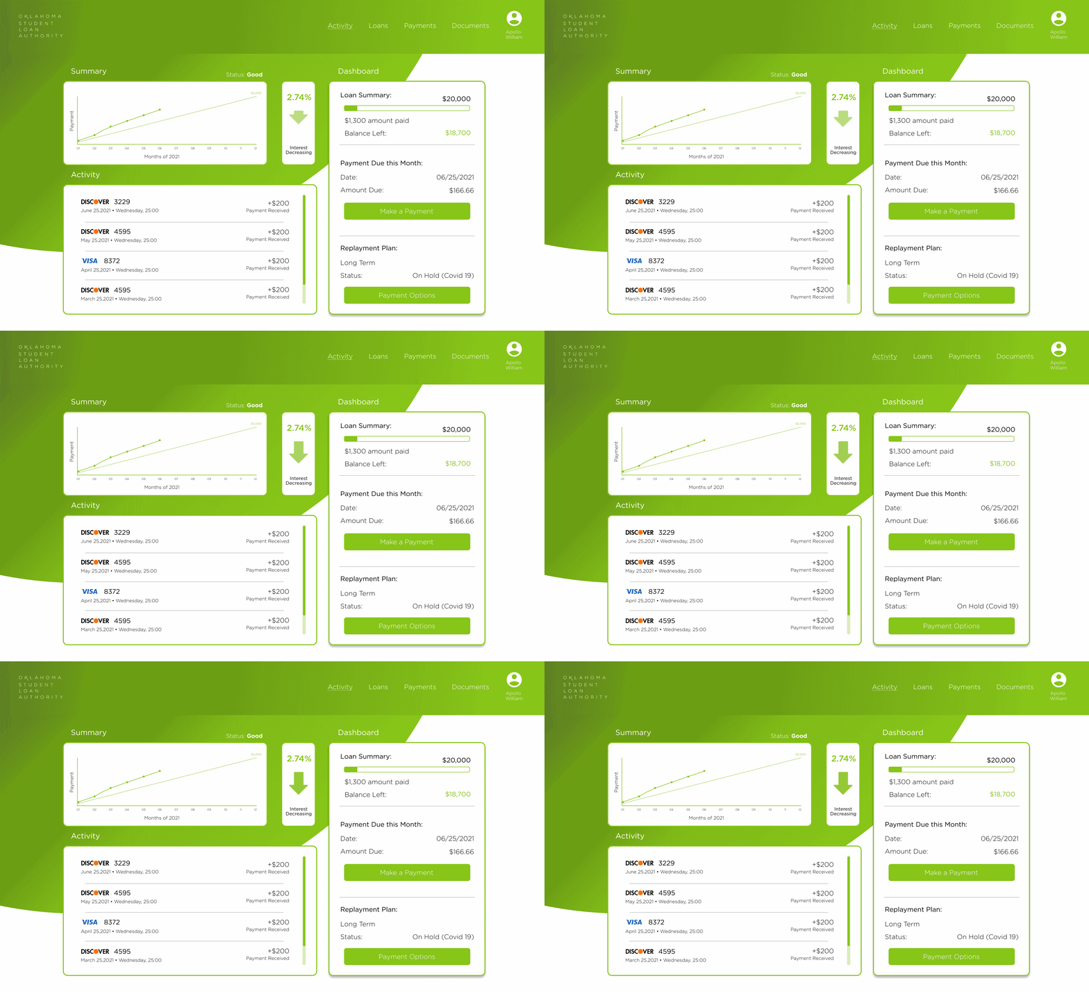
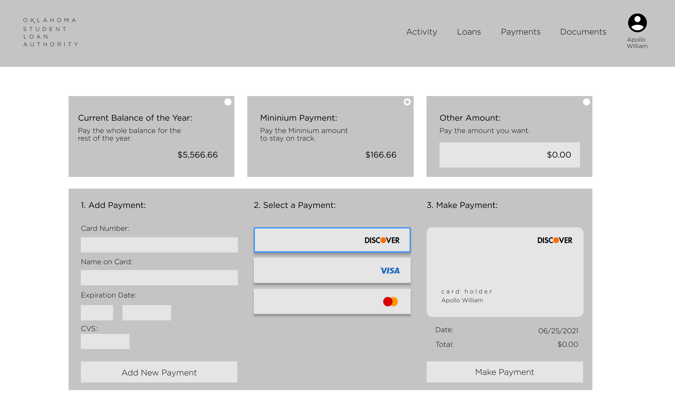
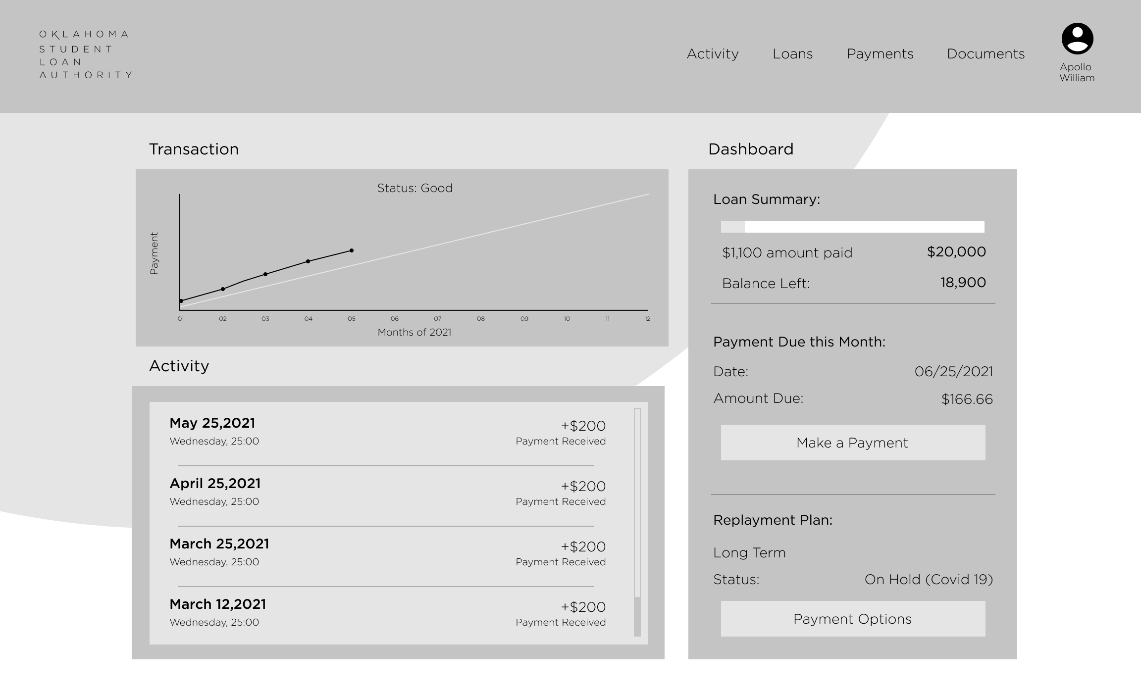
Next is the Journey mapping. I wanted to make it as simple as possible. I did think about giving the option of users being able to change their payment plan. But I just wanted to focus on simplicity and the payment process. The reason for this is that users mainly go to that site to pay their student loans. The Journey Mapping starts with the home page. I wanted to give as much information as possible to the users because the original site shows the users the whole balance and payment. So I packed the home page with a graph to show the progress that users have made for the year and that they may feel a sense of accomplishment. I also added an animation to show the users that the faster they pay their debt, the lower the interest they have to pay. The animation should give the users another sense of accomplishment. I also added a history payment for the users to keep track of payments. Last but not least, I added the make a payment and payment options buttons so that users do not go looking around for the buttons.
Wireframes.
Style Guide.
color.
The main color is a pale green color named #87C519. The secondary color is white (#FFFFFF) and a light blue (#3694FF) color for selection. The color is to reflect the color of the logo and brand. I also added (#87C519) green in different shades to add some contrast to the site. I also made it so if the user is not keeping up with their payments, the site will turn red (#c51919).
fonts.
There was not much use of fonts here since I was trying to keep things simple. So the display font and running text font are both the font Gotham in different weights. The display font is Gotham Book, and the running text font is Gotham Light.
style.
The Style I was trying to go for is a clean and simple web page. I rounded corners to give it a soft and friendly look. Nothing fancy and nothing to in your face was the key to this design. This website should be a simple site that people pass through and not linger.

The Finial Product.
Solution.
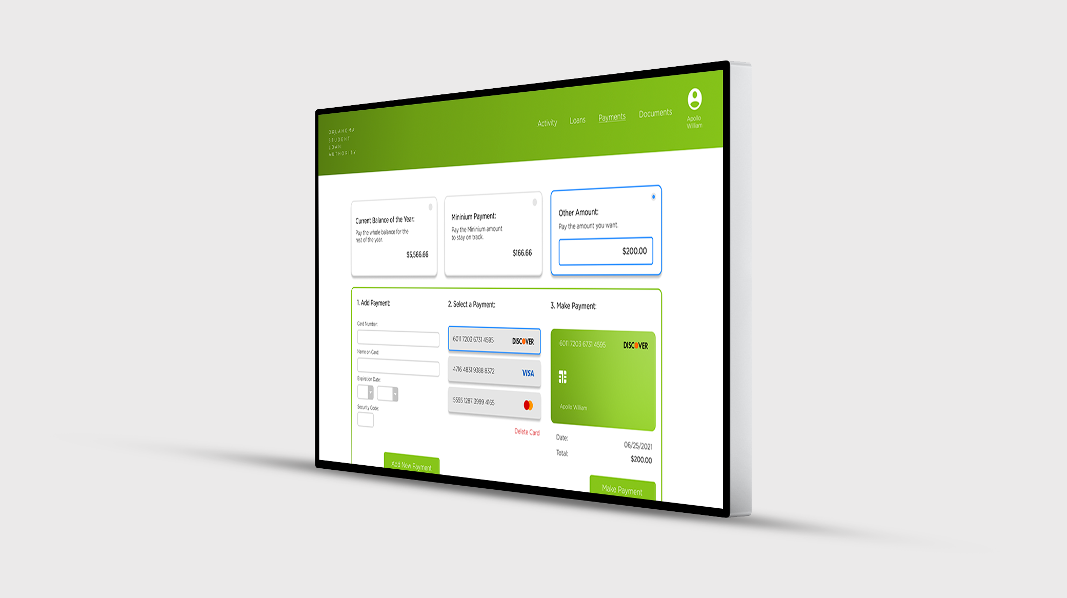
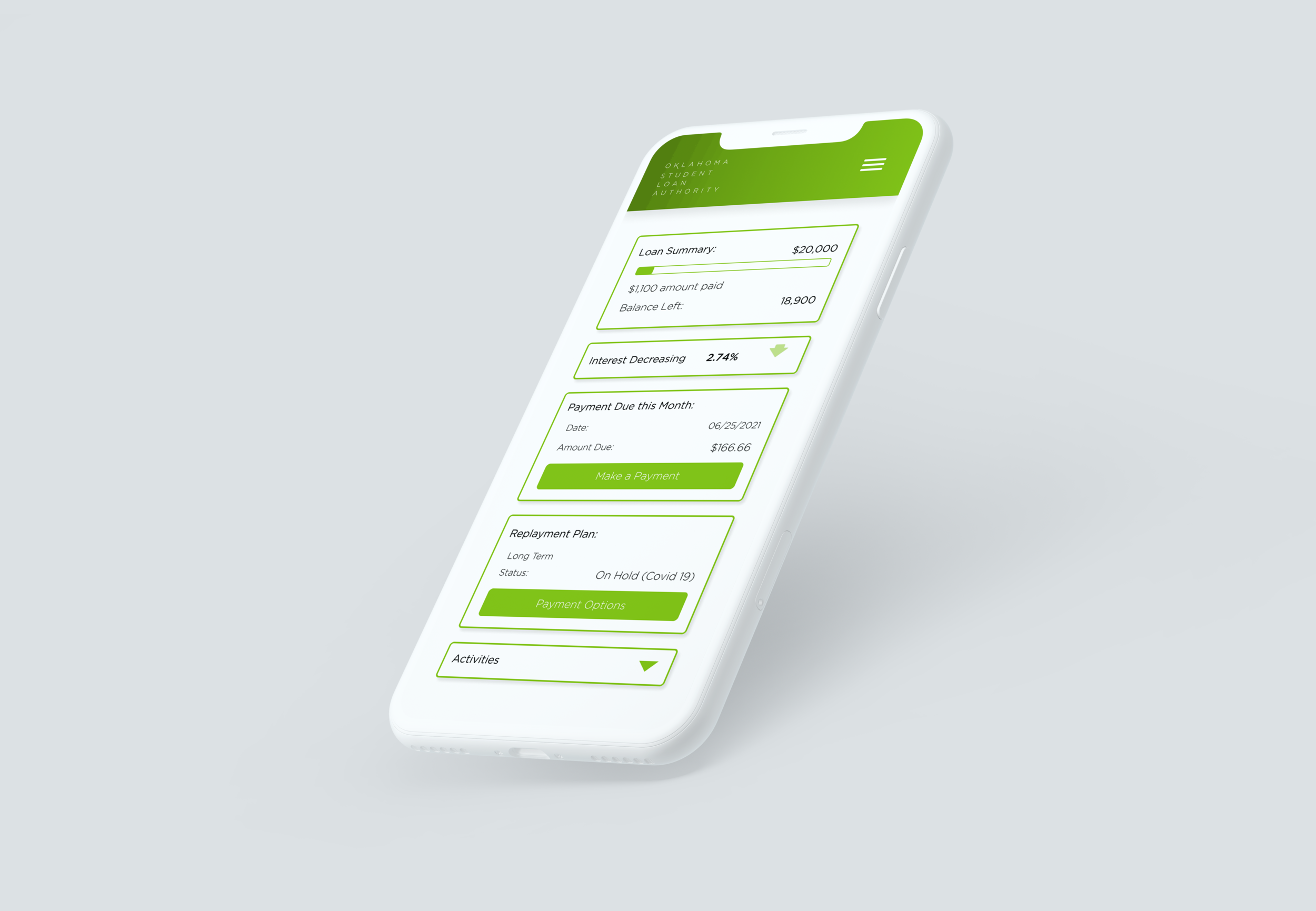
Here is the final product for the Oklahoma Student Loan Authority. As you can see, the OSLA website got a new UI look, trying to keep it clean and fresh. Added to the website is a graph that shows the user's progress during the year to give the user information and encourage them to keep being faithful to their payments. Underneath the graph is a list of the payments the users have already made to keep track of their payments and to confirm payment after paying. To the right of the graph is an animation of an increase or decrease of interest. The animation is to help encourage the user to pay more than the minimum payment so that they do not have to pay on interest. To the right of the animation is the dashboard. It helps the users see the overview of the user's debt as well as the payment plan. There is also the ability to pay and change payment plans in the dashboard. On the next page to complete the payment I gave the users two quick options to pay or put in a set payment. The quick options are to pay for the whole year or the monthly payment agreed upon by the user and the loaner. Other than that it should be a simple user experience to add or select a card to pay for the student loan.

